
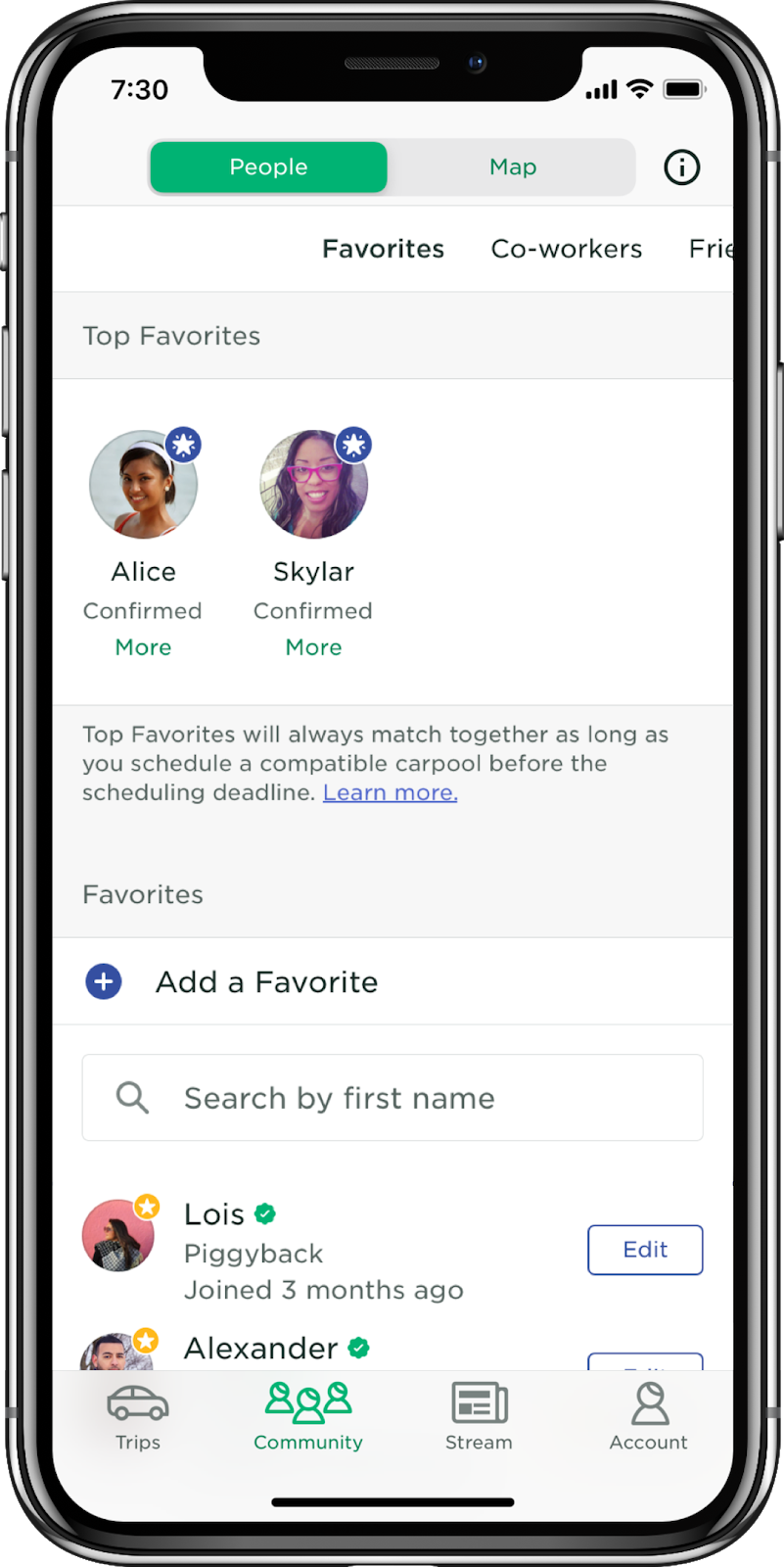
Top Favorites
Giving carpoolers greater control when matching during COVID-19
The Challenge
The COVID-19 pandemic changed commuting habits in the US, and Scoop carpooling was moving fast to improve safety for essential and returning workers. Although normally matched via algorithm, PM suggested we look at a new feature allowing direct user-to-user matching, similar to COVID "bubbles".
The Research
Without normally allotted time for discovery, I efficiently vetted the design concept by dovetailing a seperate COVID-19 survey project and reviewing past qual feedback channels.
After the design phase, I then user tested the "Top Favorites" solution at medium-high fidelity with diverse carpooler segments (n=8).
The Impact
User feedback strongly supported direct carpool matching as the #1 safety feature not yet implemented.
Usability testing identified 15 usability concerns, leading to design improvements to discoverability and request management.
COMPANY
TIMELINE
METHODS
MY ROLE
TEAM
Project Background
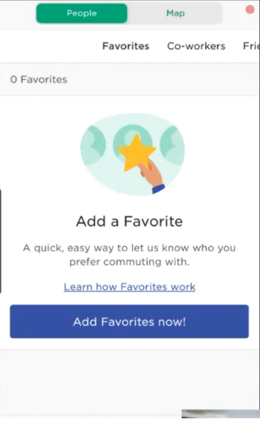
Favorites 101
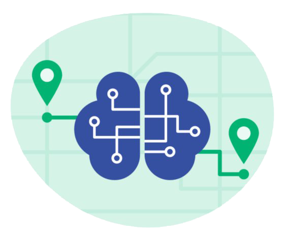
On Scoop, carpoolers are normally matched to best routes via algorithmic “black box”

“Favoriting” lets carpoolers indicate who they enjoy riding with, weighing the algorithm
COVID-19 Impacted Carpool Trust & Safety

COVID-19 greatly reduced commuting, although essential workers were still relying on carpools
Hypothesis that “black box” matching may not be seen as trustworthy or safe. Varied matches could increase perceived exposure risk.
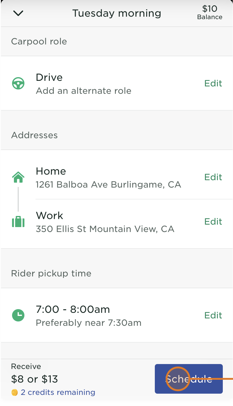
"Top Favorites": Initial Ask from PM
Product had been mulling direct carpool matching (more "bubble"-like) since the pandemic hit.
Product Management outlined their ideas for “Top Favorites”, an extension of the Favorites system allowing for direct carpooler-to-carpooler matching. This was an early, working draft in a PRD.
Carpoolers can make a few others their “Top Favorites”
Top Favorites always match with one another if their requests are compatible
A month earlier, I had assisted the PM lead's team with past qualitative data on matching algorithm improvements. So he knew he could come to me early to bounce ideas off of prior carpooler data. He asked me to prepare a “POV” document consolidating past related research.
Needs Gathering
This project was not allotted any dedicated exploratory user research time. I did what I could to use existing resources to scrap together as much nuance as possible to help guide the Product Designer and future PM roadmap.
Exploratory Research Goals
Vet the COVID & non-COVID use case of direct carpool matching
Gather user needs and nuances on direct carpool matching during COVID‑19 to aid design ideation
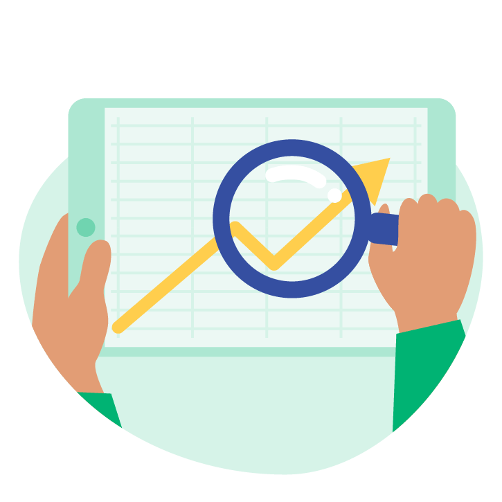
Mining Past User Feedback on Matching & Favorites
My PM had asked for everything we knew about Favoritng and prior requests for direct matching (in what we called the “POV document”).
One of my other projects was a well-documented database of qualitative feedback from things like support tickets. So it was quick to gather a fairly good historical record of this topic!
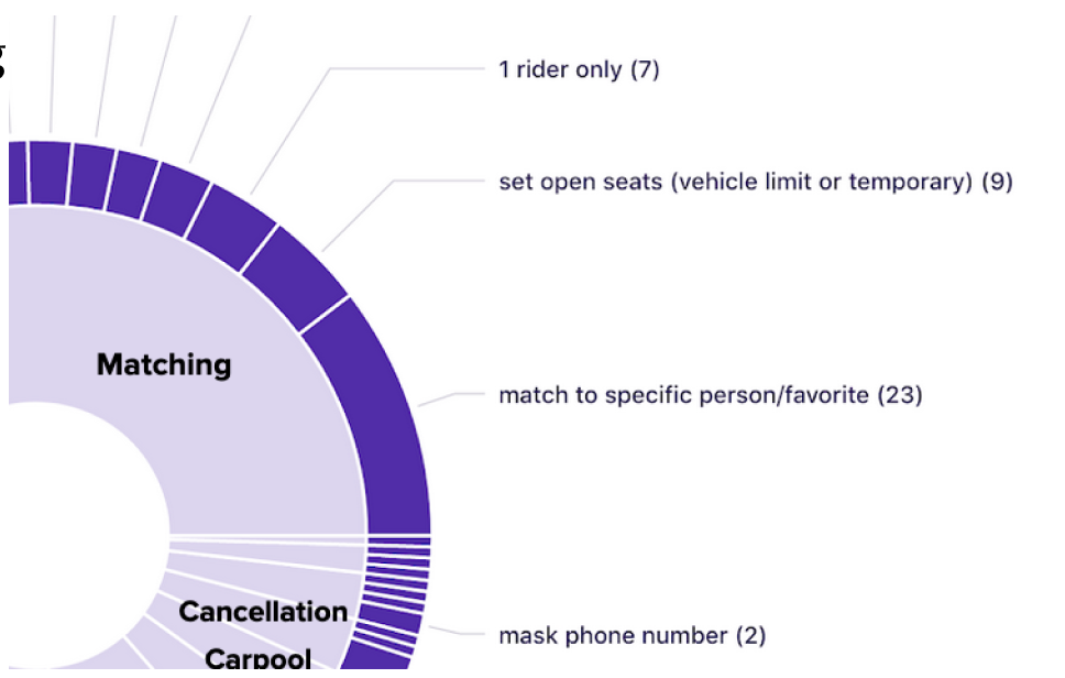
An excerpted chart of feature requests on carpool matching
The non-COVID use case for direct matching had some evidence but was not clear cut.
Raised a few edge cases to explore, such as difficulty of two carpoolers aligning scheduling times.
Surveying Commute Sentiment
One of my other big projects was surveying past and current carpoolers on their sentiments around COVID, commuting, and Scoop safety.
The initial POV document didn’t cover COVID use cases, so I dovetailed Top Favorites into the survey. This was a monthly, iterative process.
I slotted in a few core questions that could help vet the concept and guide big design decisions foor Top Favorites.
These questions while led by me were collaborated on and prioritized alongside Analytics, the head carpool app PM, and Trust & Safety lead.
Strong validation that currrent and past users wanted direct matching due to COVID safety.
Returning users may need assistance forming a Scoop “bubble”.
Users largely uninterested in matching more than one carpooler even if they knew each other.
Analytics on ‘Favorite’ Log Data
After brainstorming further data needs with Karen (Designer), we wanted to double click on how users had been favoriting in the Information Architecture.
I pulled in a Product Analyst and he pullled some log data which told us that:
- Post-trip was a major moment for Favoriting
- The Top Favorites UI should be somewhat prominant in the main navigation since users were not using secondary menus to Favorite
Handoff to PM & Design
Karen, the Designer, took my POV doc - pre-COVID feedback data, analytics, and survey results - and used them to craft detailed use cases and stories.
My high-level take was that Scoop as an app is designed for black-box matching, so we needed to carefully consider interpersonal dynamics and closing the scheduling loop for this whole new type of matching.
PM in parallel focused on the COVID use cases and solidified their direction in a document (PRD) with our input.
Overall, I was pleased to be able to contribute to high-level vetting given the time crunch, but I didn’t have the research backing to address several hypothetical pitfalls or other undiscovered user nuances. In other words, I helped confirm this directional instincts would serve users, but not quite as much qualitative color on how to do so best.
SIDEBAR
Advocating for Research Sprints
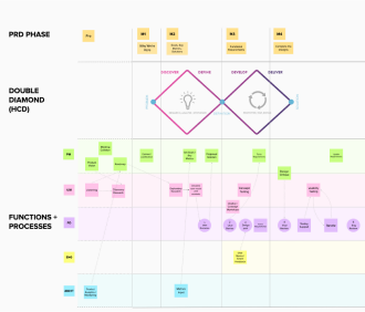
I used this project as a case study to advocate for UXR invovlement before PRD’s were set in stone.
Process flow diagramming helped me visualize the current and desired state of UXR at Scoop to my manager, the director of UX.
My department then used this diagram and examples to create more rigid sprints with Product that build-in time for exploratory UX research.
Two other departments jumped on this chart and process change to get Anlaytics and Marketing invovled earlier in the Product process as well!
Usability Testing
Landing on Testing
During the early design phases of Top Favorites, I met with PM and the Designer to determine if and at what stage we wanted to do evaluative testing.
We determined that a medium-high mockup was appropriate for testing. This was looking like one of the most complex interactions ever designed for the app, and so we wanted it to feel as “real” as possible given time constraints. We definitely wanted to see if users understood and could succesfully complete tasks. Enough time for revisions was built into Design timeline.
Designing the Usability Test
After the Designer walked me through the current design and any usability doubts she had, I articulated my plan for usability testing.
This plan was workshopped with Design while going through the prototype together and then agreed upon in a meeting with UXR, Design, and PM. We then worked on fleshing out some more detail screens and variations for the test, and Karen (Design) put together the Invision clickthrough.
Discoverability of Top Favorites & first‑time use
Parsing requests, notifications, and status of Top Favorites
Comprehension between Favorites and Top Favorites
Reactions to core user need for this feature (backfilling)
Testing Process
I always invite the team to listen in and take notes during sessions. I encourage teammates to attend at least 2 sessions, and host debrief sessions afterwards.
Usability Findings
After analysis of sessions, I identified 15 usability concerns as well as feedback on high level design such as general information architecture and value proposition nuances.
Initial discoverability was a major source of user error. A stronger empty state was recommended.
Users struggled to actually schedule trips with Top Favorites. Stickied instructions were recommended.
Users discovered request limits too late which may create social awkwardness.
Alignment on Final Design Iteration
I sent the deck early so we could focus our readout meeting with Design and PM on collaboratively resolving the largest usability issues.
Most usability resolutions were pretty quickly agreed upon. The issues with the most debate involved two decisions about walking back previous alignments that therefore were not included in the usability test (including the C-suite weighing in).
I contributed my critiques based on usability heuristics, and reminded the team that the usability results were not data points on these two particular topics. At the end of the day, PM determined the changes were worth the risk of untested design changes, and design progressed.
Results & Learnings
Top Favorites was launched in Nov 2020. Although my final days at Scoop were at the end of that month and I never received a full impact report, I know that at least some users were taking Top Favorite trips and I didn’t identify any issues in my qualitative listening channels.
Lessons learned:
- Push for greater organizational understanding and schedule for exploratory user research
- Get C-Suite buy-in before, and not after, the only slotted usability test